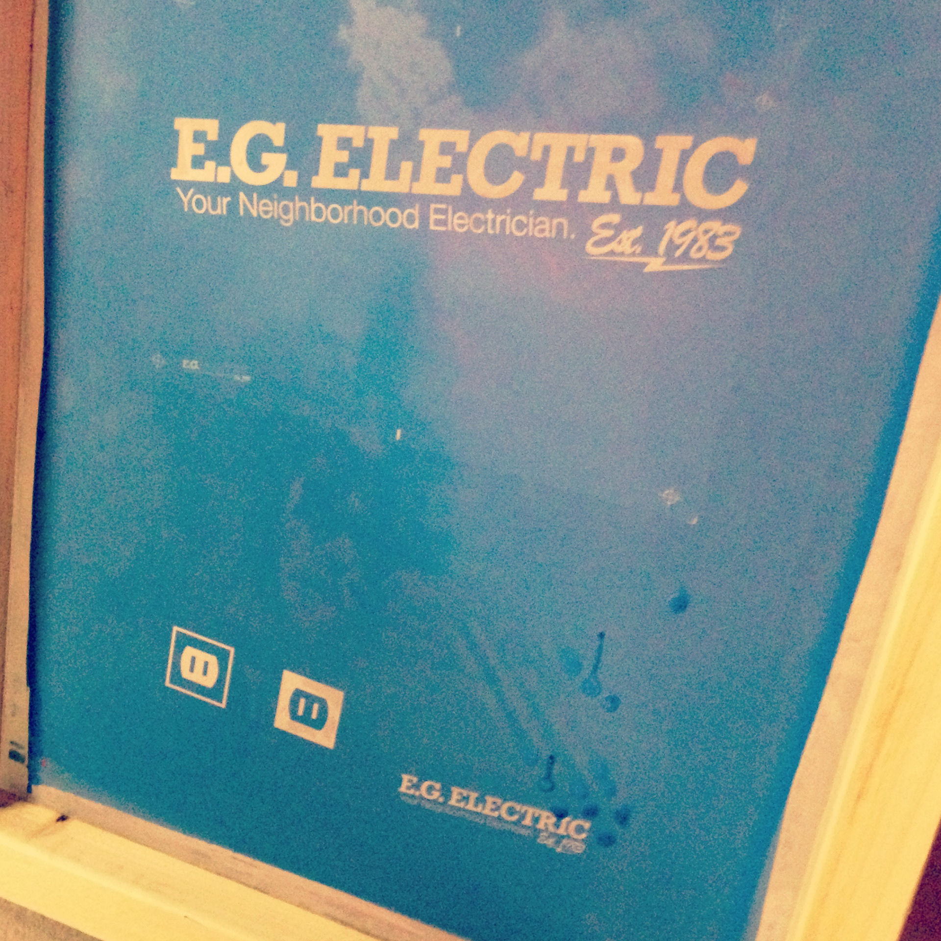
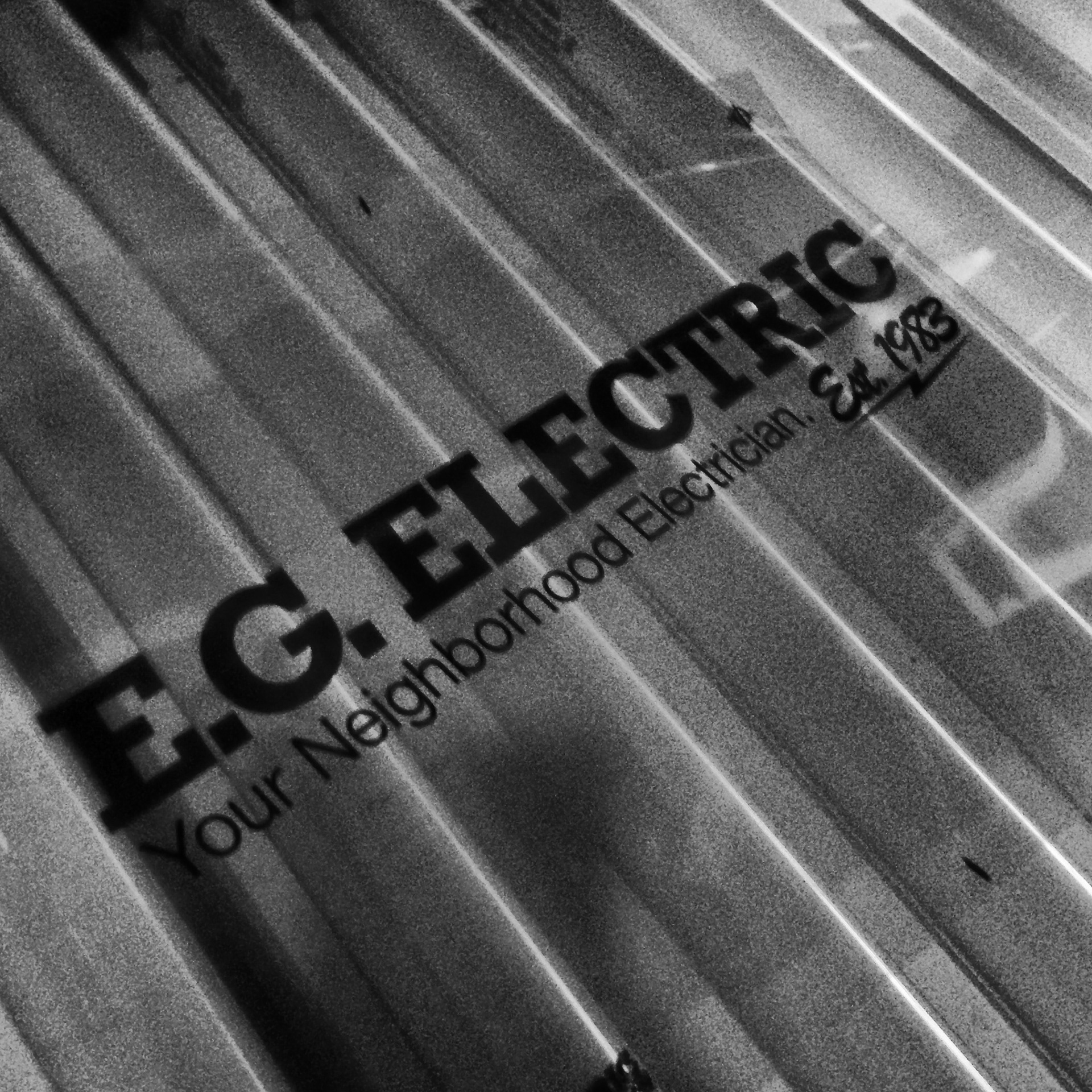
E.G. Electric
Your Neighborhood Electrician.
Your Neighborhood Electrician.
EG is a local electrician company that I was asked to branded/rebranded. They have been around since 1983. I found that they have a strong loyal customer base and they didn't want something to flashy or over the top.
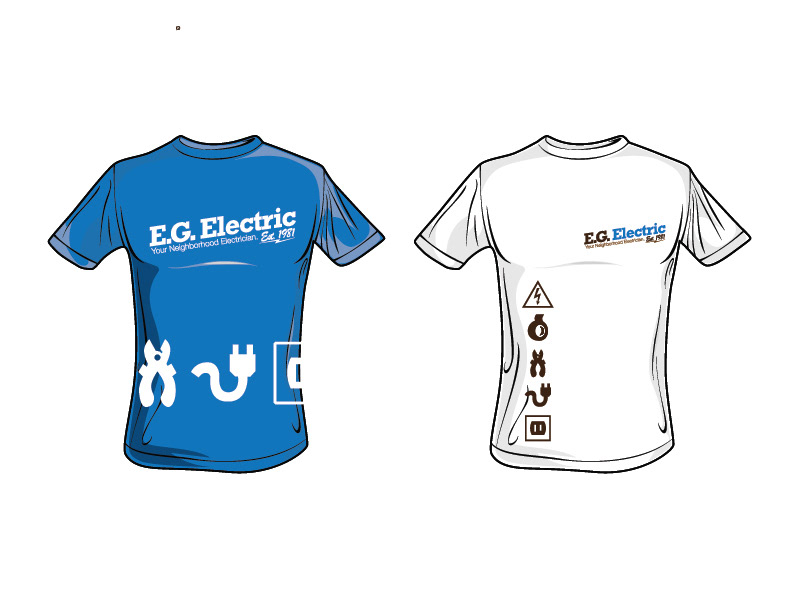
I went with a heavy slab serif font and bold colors that had a fresh, but almost retro feel without being dated. They needed some type of tag so i gave them one lucky they liked it. The name needed to stand on its own without a symbol or icon. I did design some icons for EG that can be used throughout there branding and advertising.
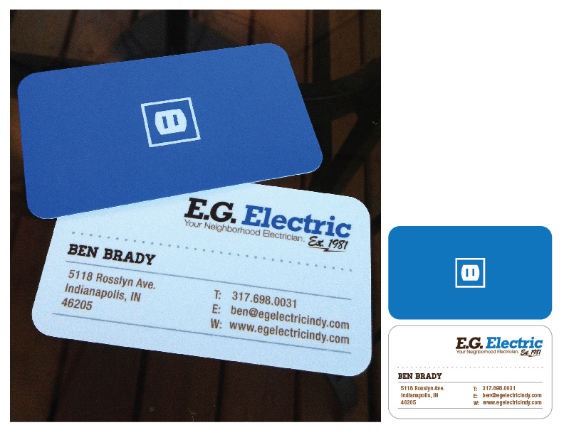
We just got the business cards back from the printer I still need to take a better picture of them, but they look great. They're have a flat sheen with a UV varnish on the icon, logo and name.
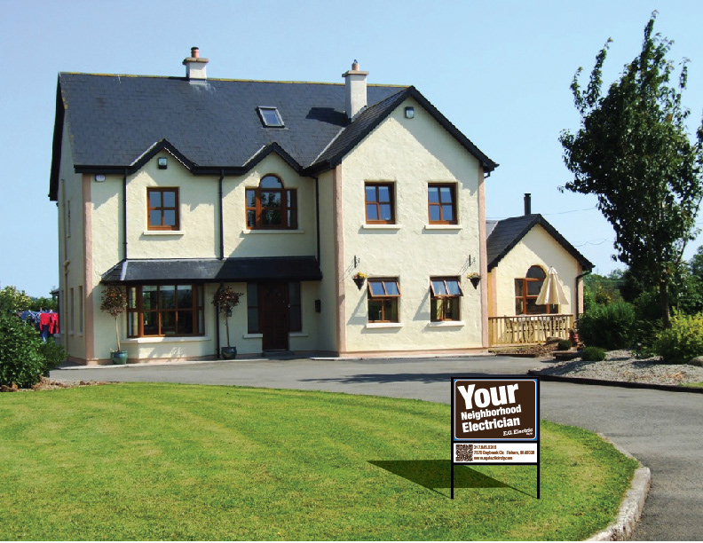
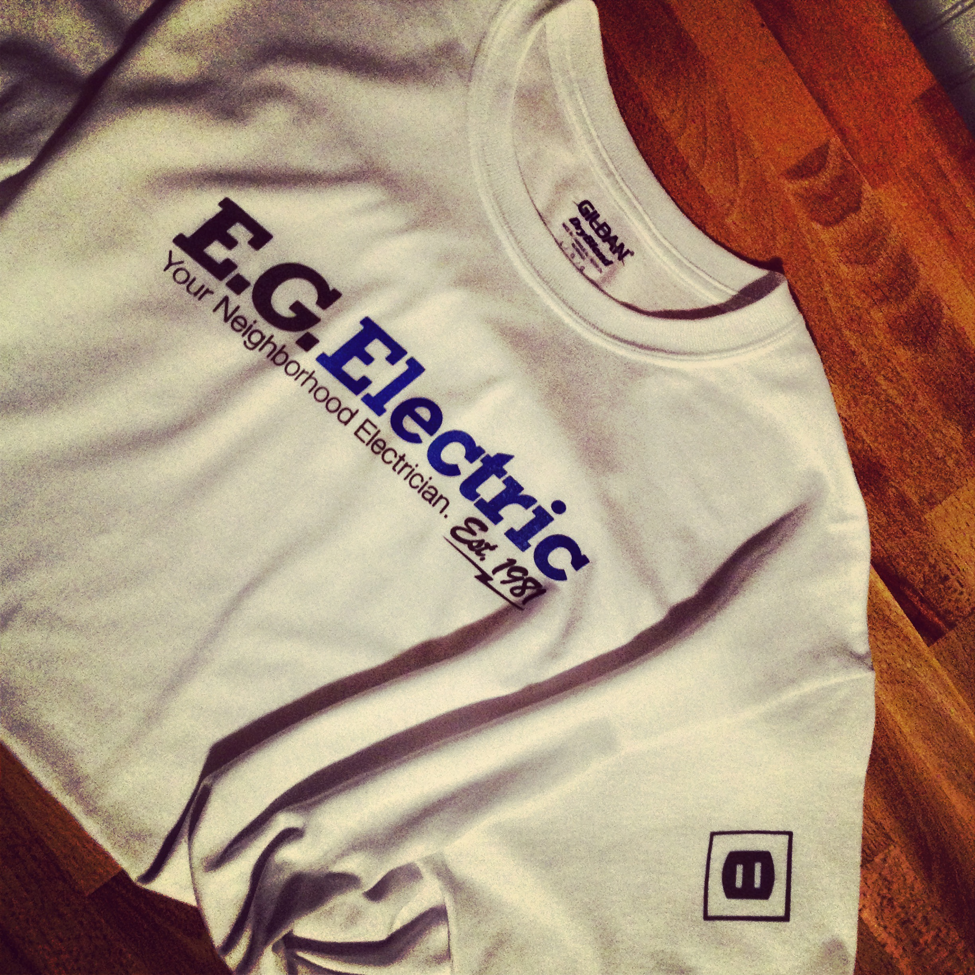
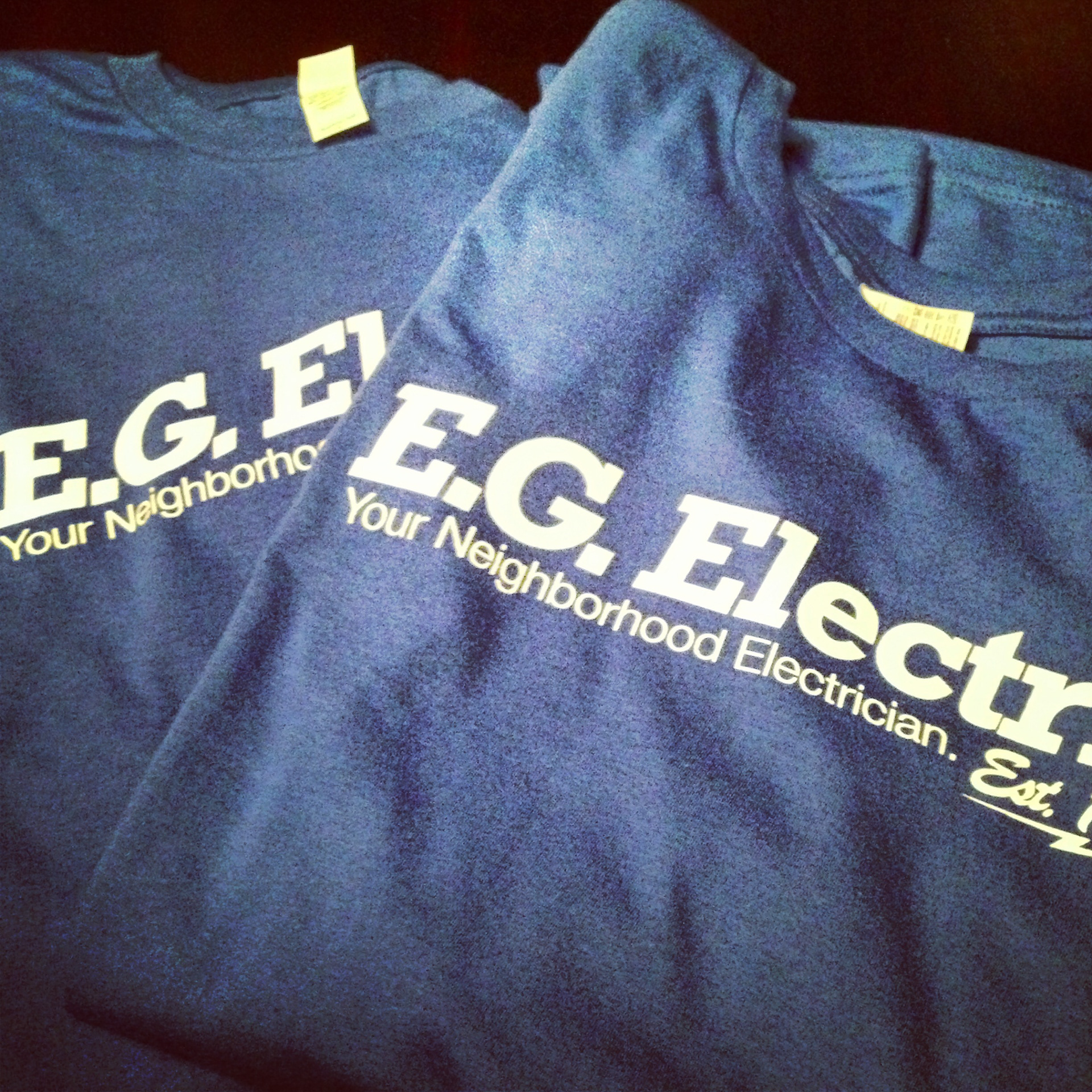
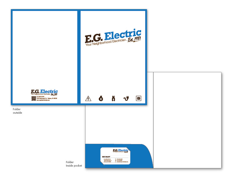
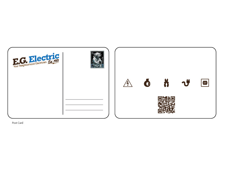
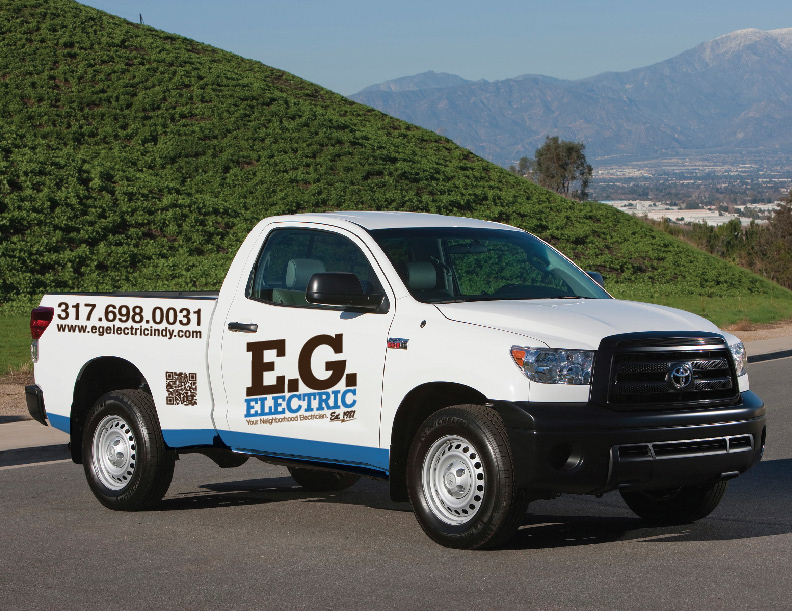
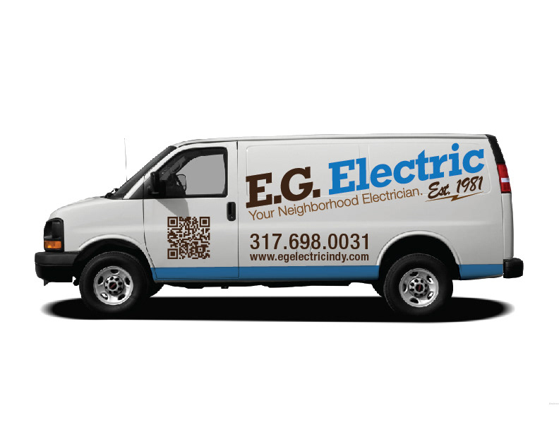
We are in the process of getting folders, t-shirts, car wraps, post cards and lawn signs made.
You will see use of a QR code in some of the touch points this will allow people to scan it and get EG's contact information with out having to type it all into there phone.
I went with a heavy slab serif font and bold colors that had a fresh, but almost retro feel without being dated. They needed some type of tag so i gave them one lucky they liked it. The name needed to stand on its own without a symbol or icon. I did design some icons for EG that can be used throughout there branding and advertising.
We just got the business cards back from the printer I still need to take a better picture of them, but they look great. They're have a flat sheen with a UV varnish on the icon, logo and name.
We are in the process of getting folders, t-shirts, car wraps, post cards and lawn signs made.
You will see use of a QR code in some of the touch points this will allow people to scan it and get EG's contact information with out having to type it all into there phone.

Please click or comment if you like it.